Drew Barrymore
Rebrand • Editorial • Television
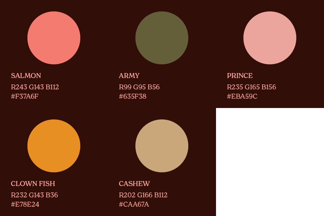
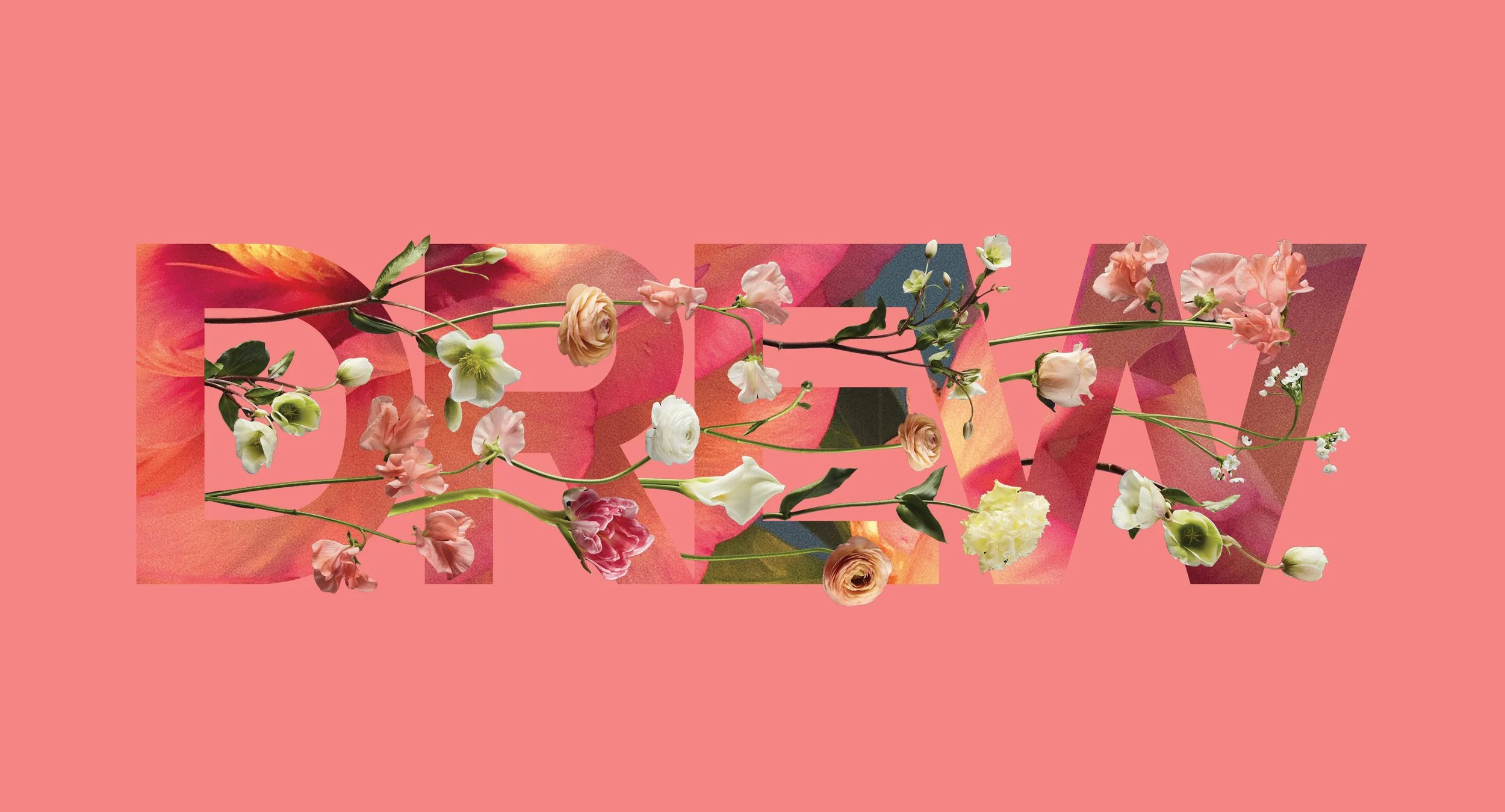
We worked closely with Drew to evaluate her brand positioning and create a cohesive set of brand visuals while preserving her signature sense of fun, amiability and joy. With Drew, we created a series of color palettes that are adaptable throughout the seasons and introduced the use of humanist typography to help maintain a friendly, approachable brand. The use of graphic retro colored shapes emotes nostalgia and happiness. The rebrand marks a move towards a new identity that encompasses television, print and digital.
The Drew Network
Drew approached us to create an identity for her upcoming TV channel. We created a logo that references Hollywoods visual heritage and is infused with a sense of play, working hard to make the brand approachable and lighthearted.
Created a complete redesign of Drew magazine, giving it a more modern, bold look with retro, nostalgic references. It is clear and easy to navigate with a structure that highlights strong graphics, photography and typography. The visuals convey conviviality and delight.
Drew Magazine
The Drew Barrymore show
We were invited to design the logo and animation for The Drew Barrymore Show and worked closely with the show’s animator Megan Mucci to execute it. We used 70’s TV show intros as inspiration to bring a nostalgic and friendly aesthetic. Heavy use of graphic shapes with movement brings fun and energy to the title sequence. While having its own visual identity the animation is also in line with rest of Drew’s brand.


